
Here you’ll find the guidelines that serve as guardrails for our brand and corporate identity. This includes the name, logo, colors, and downloads.
We, at CHRMP, enable individuals to identify and capitalise on competency frameworks, while providing them an exceptional, unforgettable learning experience.
This is our brand philosophy, which we communicate to internal and external stakeholders to ensure that we, as a brand, are well understood not only in market terms, but also on a personal level. As a brand, we aim to influence the field of HR, through training and providing experience and credentials for HR professionals. We believe that even the slightest gain of knowledge is important, for every step forward, no matter how small, is a step in the right direction.
We have become a name that individuals associate with the field of HR, with an increasing network of HR professionals.
The CHRMP logo represents our brand as a whole. It is made up of the colors Green and Blue. Green captures the essence of life and energy. Most times, an individual would associate it to the environment, but green is also a youthful color. It showcases ambition, a driving point for CHRMP and its community. It brings about the feelings of stability and endurance, characteristics that CHRMP has, but also looks to build in the professionals it influences.
Blue is a color of intelligence and wisdom. CHRMP works with the purpose of creating an impact in the field of HR, driven by practical knowledge and a blended learning experience. The color blue also highlights balance and feelings of dependability and trust. As a brand, this is what we work towards clearly establishing within our HR network, and it adds to the impact that we work towards creating.
The Brand Mark is derived from the CHRMP logo, where HR is highlighted to stand out. As a brand, we seek to make a difference in the field of HR. Collectively, as a team, we are driven by a passion for the HR Industry, making it only apt that we signify this in our Brand Mark. It signifies the central purpose of the brand and what we stand for, but also what we constantly strive towards, which is to identify ourselves as influencers of this dynamic domain.
The letters HR are placed in a square the color of the logo blue. A square is symbolic of balance, structure and order, and as a brand, CHRMP looks to achieve this in the field of HR. The square is seen as a shape that establishes a foundation, or a base, for further building and development. CHRMP resonates with this meaning, as through our training and certifications, we look to establish this foundation within HR professionals and even build beyond that.
CHRMP as a brand associates primarily with three colors: Blue, Green and White.
Blue is the color that is the key signifier, and is supported by Green and White. They are represented in our Logo as well, and as key colors associated with the brand, these colors should be dominant in any and all visuals.
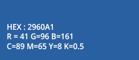
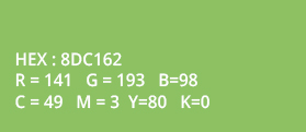
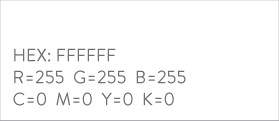
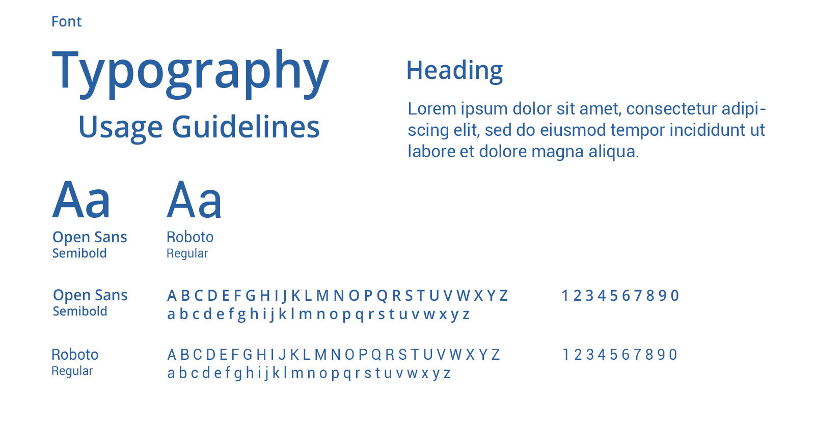
CHRMP sees two fonts used through their copy, Open Sans and Roboto. These fonts bring about a professional feeling but also are softer and friendlier in nature, and it is easy on the eye. Bold and regular weights of the text are used to distinguish within the copy, in order to provide for easy reading and understanding. Text is left aligned wherever possible.
Our Brand Voice is the constant tone we take with our customers, irrespective of the platform. It highlights our approach to situations and instances, and adds to our brands personality. Our tone varies from platform to platform, and takes into consideration specific audience and platform behaviour when communicating.
The Brand Voice is described as inspiring, motivating, passionate, validating, helpful, approachable and confident. This is the tone that we seek as a brand, and all communication should follow this description.
As a Brand, we have identified key elements of our messaging that add to the learning experience we offer. The elements that we identified are recognition, latest knowledge, community, experience, value for money and success. These elements make up what we offer, and it is also what our customers consider important. These elements represent the essence of CHRMP as a brand and what our community experiences, and it comprehensively describes what we look to give to a HR professional.

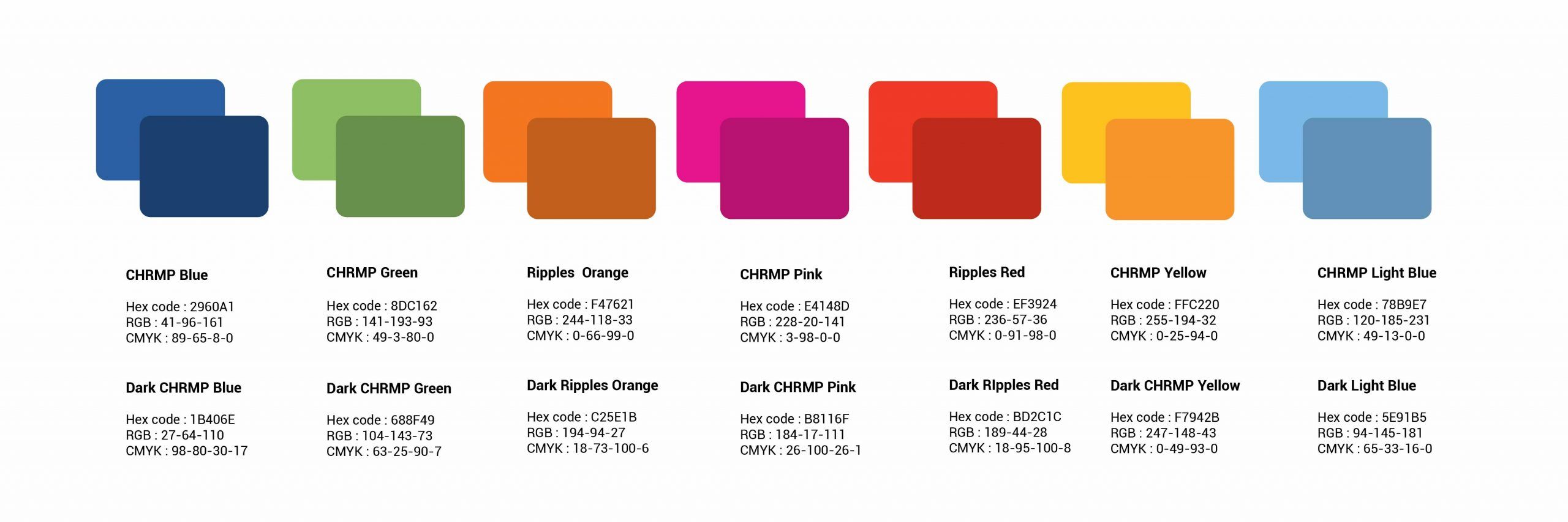
To allow us to create more depth within our illustrations, we use an extended version of the main brand palette. This expanded version of our brand colors allows to create more depth and shadow in our graphics.
These colors are for use solely in illustrations.
DO NOT USE in headlines, backgrounds or body copy.
The colors below are for designing people in Illustrations. Use colors for hair/skin/nails.

© 2007-2025 CHRMP| All Rights Reserved | Powered by Ripples Learning & Research Private Limited